Cedars Sinai Digital Scheduling
Creating the Test & What We Wanted to Learn
Before jumping into solutions, we needed to understand the real mental model patients use when searching for a doctor and deciding to book.
We structured this initiative around three core research goals:
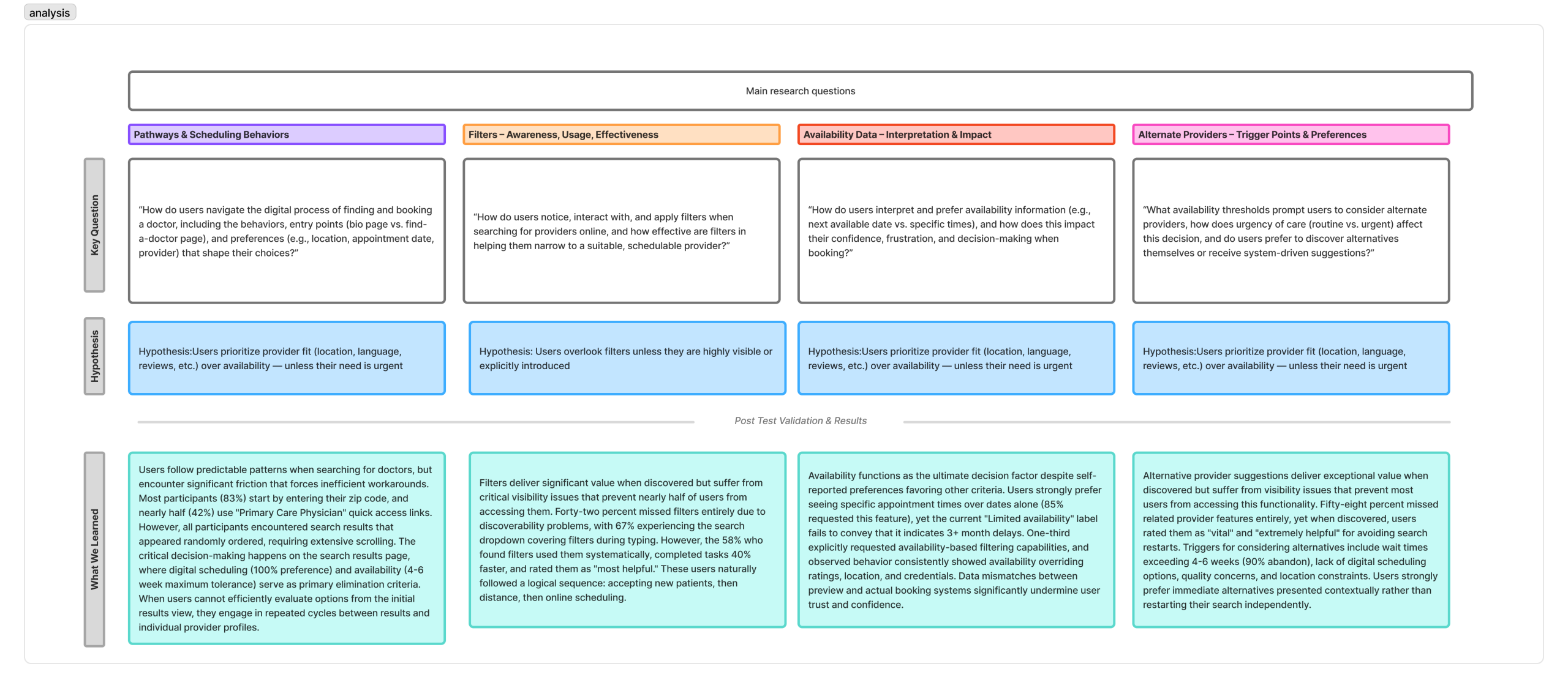
1. Pathways & scheduling behaviors: How do users navigate the digital process of finding and booking a doctor, including the behaviors, entry points (doctor bio page vs the find a doctor page), and preferences (eg., location, appointment date, provider) that shape their choices?
2. Filter Awareness: How do users notice, interact with, and apply filters when searching for providers online, and how effective are filters in helping them narrow to a suitable, available doctor.
3. Availability Interpretation & Impact: How do users interpret and prefer availability information (e.g., next available vs specific times), and how does this impact their confidence, frustration, and decision-making when booking?
4. Alternate Providers: What availability thresholds prompt users to consider alternate providers, how does urgency of care (routine vs urgent) affect this decision, and do users prefer to discover alternatives themselves or recieve system-driven suggestions?
Mapping the Current Journey & Identifying Pain Points
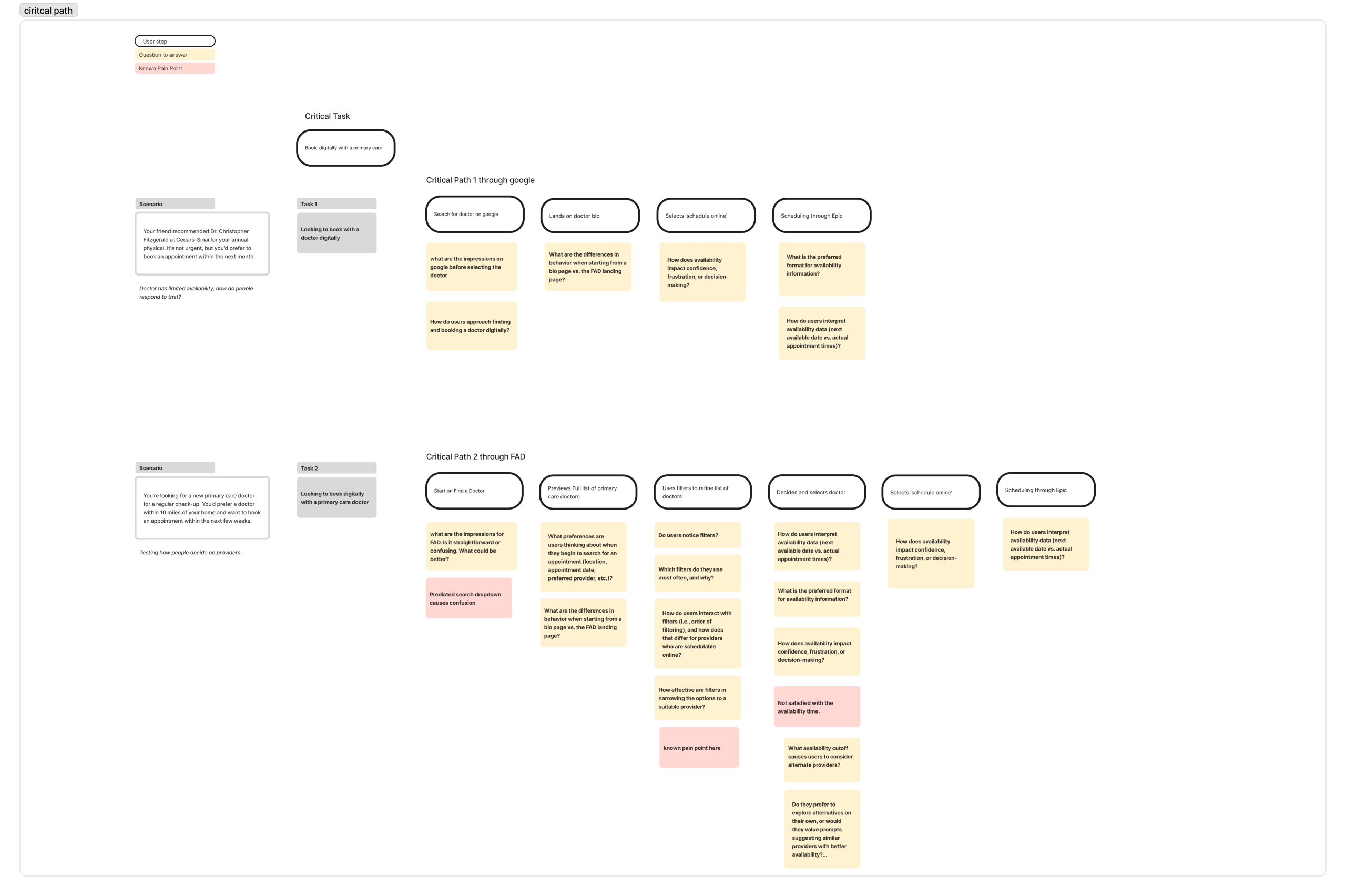
Before designing anything new, we had to understand what existed. We mapped the end-to-end patient journey through the current Find a Doctor tool. Starting from the moment someone lands on the page to the point of scheduling.
Through analytics data from Adobe Analytics and early stakeholder input, several friction points emerged across the journey. We mapped two critical paths to two different scenarios where a user enters find a doctor through google or starting from the find a doctor page.
The journey considered questions and known pain points at each phase of the journey. This map became the foundational artifact that aligned the team and gave us a shared language for where we needed to focus.
Creating the Prototype
With pain points clearly defined, we moved into the design phase to begin testing our driving questions and hypothesis.
The prototype was built around three key design hypotheses:
- Hypothesis 1: Users prioritize provider fit (location, language, reviews, etc) over availability, unless their need is urgent
- Hypothesis 2: Users overlook filters unless they are highly visible or explicitly introduces
- Hypothesis 3: Users would not pursue alternate provider suggestions unless availability is extremely limited
- Hypothesis 4: Showing specific appointment times improves clarity and confidence in scheduling decisions
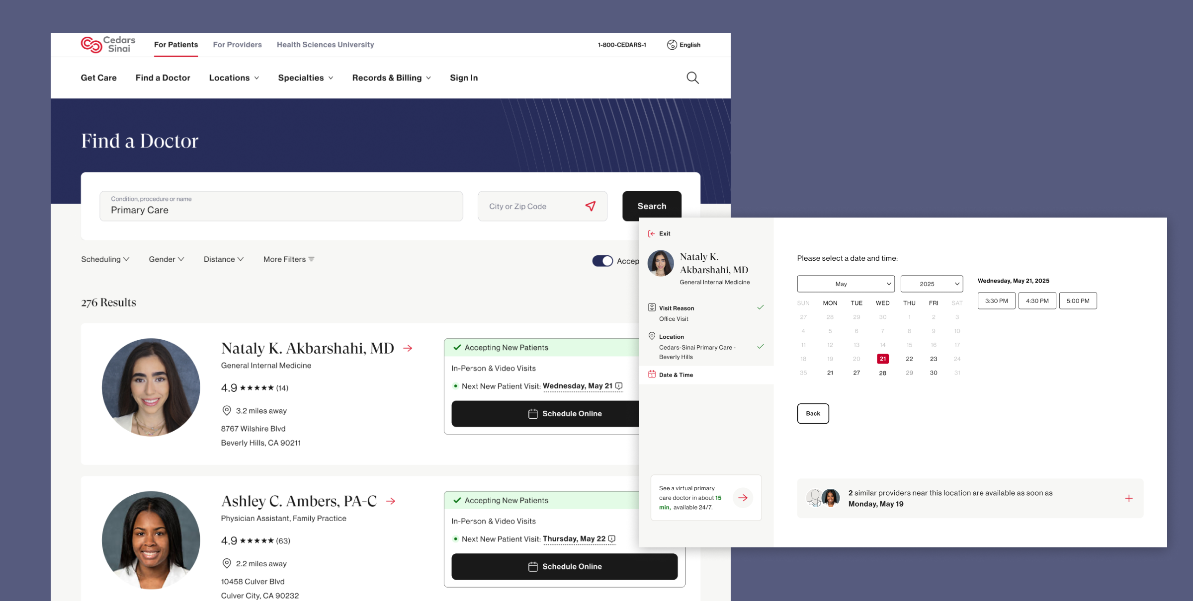
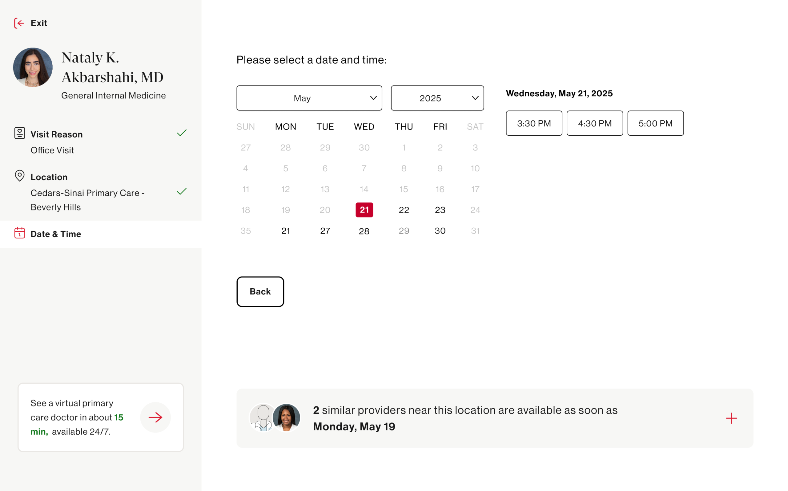
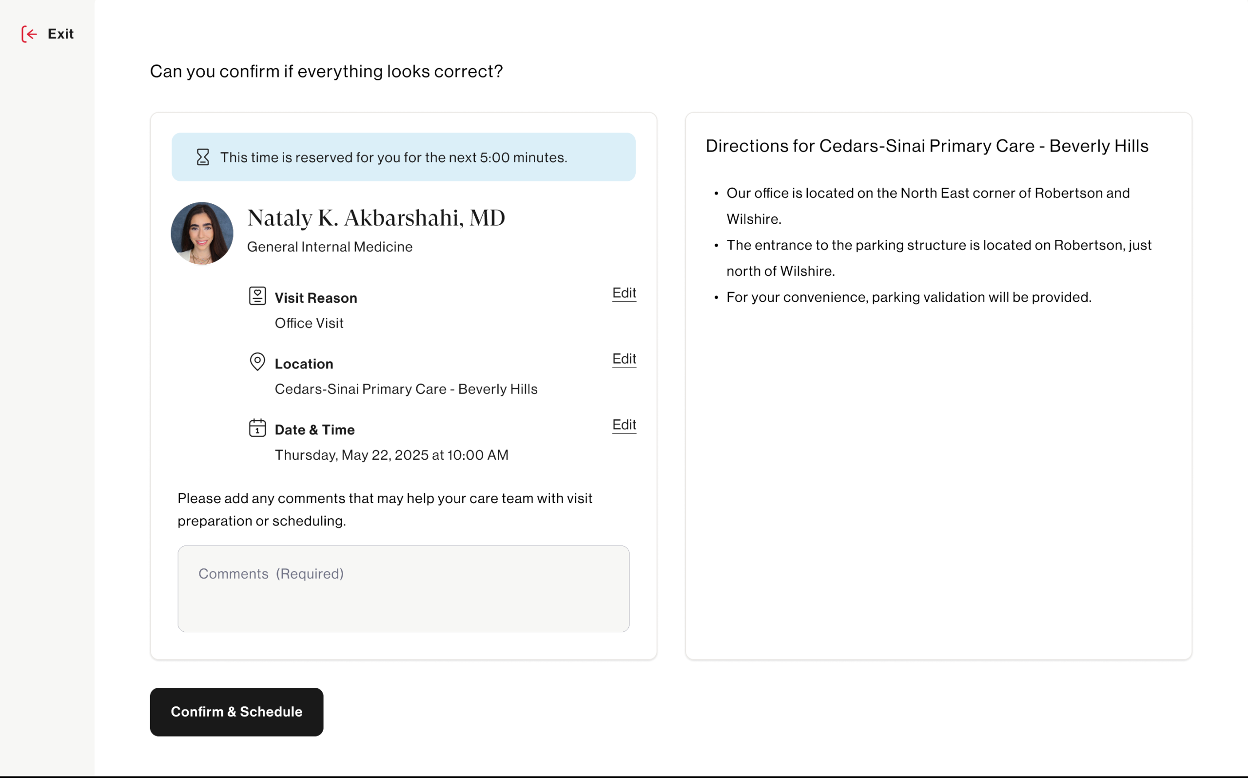
The prototype was designed to feel real enough to elicit genuine reactions — not a rough wireframe, but a high-fidelity, clickable experience that mirrored the actual product closely enough for patients to engage authentically.
Launching Unmoderated Tests via UserTesting
With the prototype ready, we launched an unmoderated usability study through UserTesting to capture behavior at scale without the influence of a moderator in the room.
Unmoderated testing was the right approach here for a few reasons — it allowed us to observe natural, uninfluenced behavior, recruit participants that closely matched our actual patient demographic, and gather a volume of sessions that would surface patterns rather than one-off observations.
Participants were given scenario-based tasks that mirrored real-world intent:
“You’re looking for a new primary care doctor accepting new patients near you. Find a doctor and get to the point where you would book an appointment.”
We captured screen recordings, verbal think-alouds, and post-task survey responses — giving us both behavioral and attitudinal data to work with.
Synthesizing the Results
Once sessions were complete, the real analytical work began. We reviewed recordings as a cross-functional team ( design, research, and product) ensuring multiple perspectives shaped the interpretation. We aligned the main research questions and hypotheses with what we learned. Main learnings were:
- 83% participants begin their journey by entering their zip code and nearly half select ‘primary care physician’ from the prominent links. This is interesting since it can inform the positioning of our search input fields.
- 42% missed filters entirely and 67% experienced the search dropdown covering the filters. This directly informs how prominent filters should be visually on the page
- 85% requested seeing specific appointment times over just dates. This hit our assumption that people prefer actual appointment times to schedule with.
- 58% missed related provider feature and participants rated this feature as extremely helpful to avoid restarting a search if the current provider was not the right fit. This was something only included in the prototype and does not exist today.
Many features and design enhancements came out of this study and are currently being implemented to help create a better ux around scheduling online with a doctor.
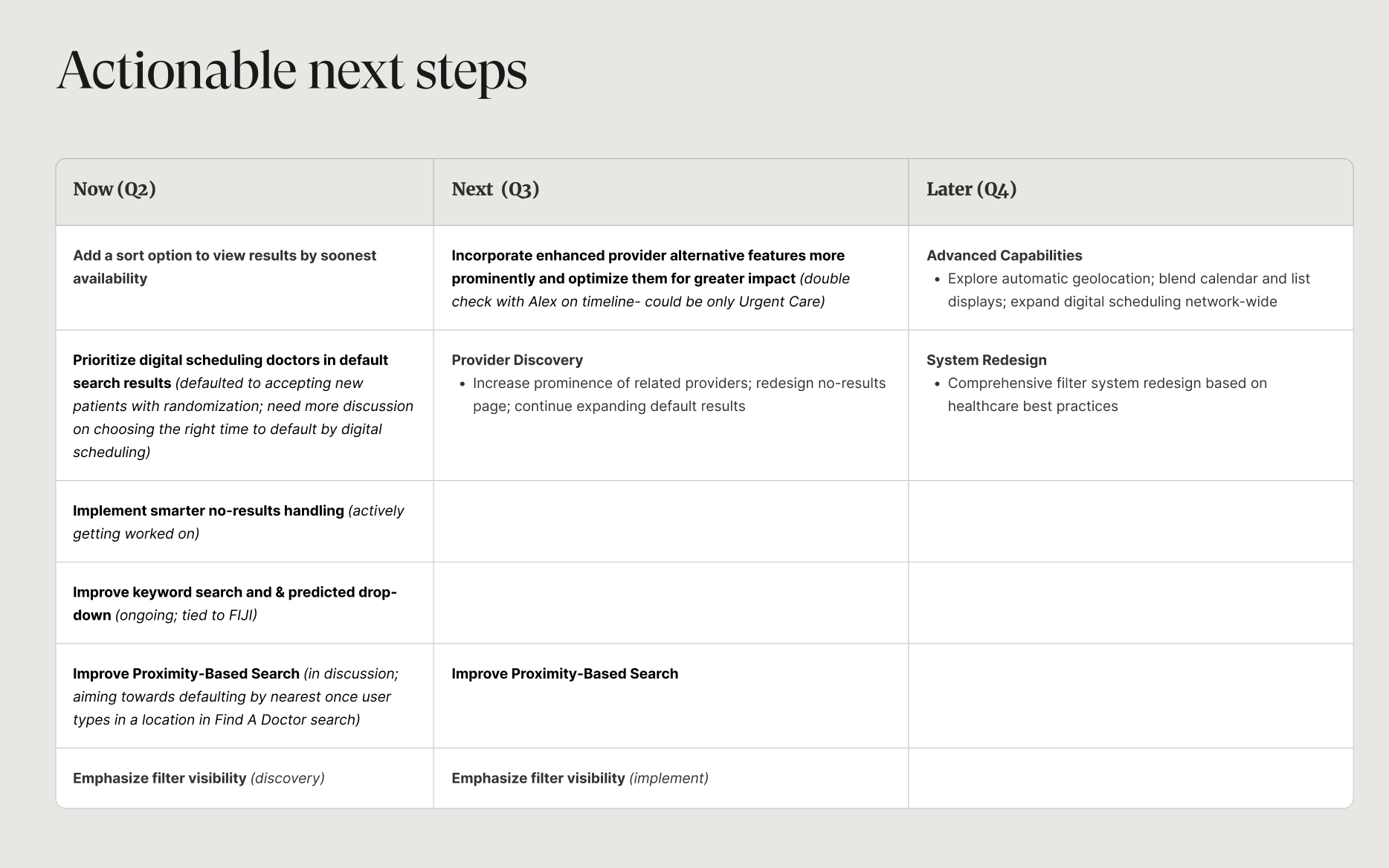
Creating Product Features & Design Enhancements
The research didn’t live in a deck! Tt fed directly into a prioritized set of product features and design enhancements that are now shaping the evolution of the Find a Doctor experience.
With the help of our product team, we prioritized features based on what can be tacked by what quarter.